
Introduction:
In today’s data-driven world, effectively communicating insights is crucial. While raw numbers can be overwhelming, data visualizations provide a powerful tool to unravel patterns, trends, and relationships hidden within datasets.
They are introducing Plotly, a versatile and user-friendly library that elevates data visualization to a new level. Plotly empowers you to create interactive charts and graphs that bring your data to life. Unlike static images, Plotly visualizations allow viewers to zoom, pan, hover, and explore, fostering deeper understanding and engagement
Get ready to transform your data storytelling with Plotly!
Setting Up (for Python users)
- If you’re using Python to create Plotly visualizations, let’s get started with the basic setup.
Step 1: Install Libraries:
- Open a terminal or command prompt and use this command to install the Plotly library.
pip install plotly
Step 2: Prepare Data:
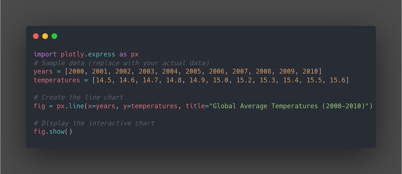
This code creates a line chart with years on the x-axis and temperatures on the y-axis. The title provides context, and viewers can hover over data points to see specific year-temperature values.
Example:
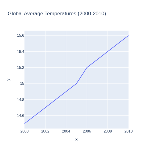
Rigid line chart
Created an interactive line chart using Plotly Python and rendered it into HTML. This approach empowers you to create visually appealing charts that users can explore by zooming, panning, and hovering over data points.
While rendering performance can vary depending on factors like data size and chart complexity, in this example, Plotly Python took approximately 20+ seconds to render the rigid line chart into HTML. This suggests that Plotly Python is suitable for creating interactive line charts, even if the rendering process might take a few seconds for more complex visualizations.

Setting Up for Plotly.js (Web Development)
- If you’re building interactive visualizations for web applications, Plotly.js is the way to go!
Step 1: Include Plotly.js:
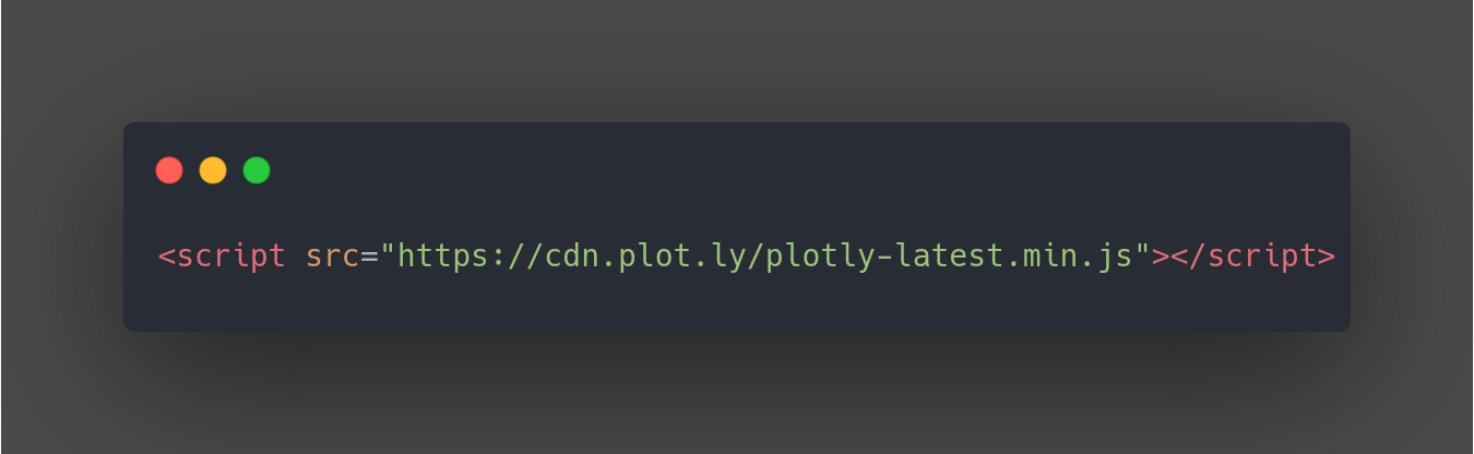
CDN (Content Delivery Network): This is the simplest approach. Add the following script tag to your HTML file, replacing the version number if needed:
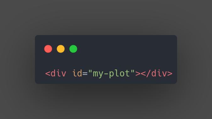
Step 2: Create an HTML Element:
Prepare an HTML element (typically a <div>) where you’ll display your Plotly visualization. Assign a unique ID to this element for referencing in your JavaScript code.
Step 3: Create and Display the Visualization:
Now you’re ready to create your Plotly visualization using JavaScript.
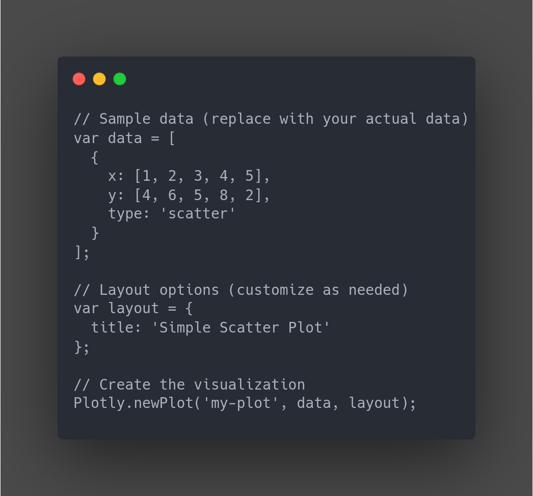
- This code creates a scatter plot with sample data and displays it in the <div> element with the ID my-plot. You can replace the sample data and layout options with your own to create various chart types.
Example:
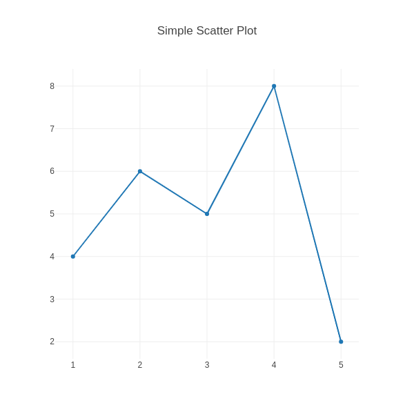
Rigid line chart
This example demonstrates how to use Plotly.js to create a static line chart and render it directly within an HTML webpage. Plotly.js allows for interactive visualizations as well, but this example focuses on the basic rendering process.
Key takeaway: Plotly.js empowers you to embed visualizations directly in your web applications, enhancing user experience and data exploration capabilities.
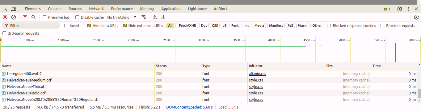
Plotly.js shines for rendering charts in HTML! In this example, a rigid line chart rendered in just 5+ seconds. While Plotly Python is powerful for data analysis, here it took 20+ seconds for the same chart. Consider using Plotly.js for web-based visualizations where rendering speed is crucial.
Here’s a breakdown of the key points:
- Plotly.js is faster for HTML rendering: The benchmark shows Plotly.js rendering the chart in under 6 seconds, compared to Plotly Python’s 20+ seconds.
- Plotly Python excels in data analysis: It provides robust data manipulation capabilities that might contribute to slower HTML rendering times.
- Choose the right tool for the job: If interactivity and data analysis are primary concerns, Plotly Python might be ideal. But for web-based visualizations where speed is critical, Plotly.js is a strong contender.
Key Differences Between Plotly Python and Plotly.js
While both Plotly Python and Plotly.js stem from the same core functionality (creating interactive data visualizations), they cater to different environments and workflows:
Purpose:
- Plotly Python: Primarily used for data analysis and visualization within Python environments. Ideal for data exploration, manipulation, and creating static or interactive visualizations as part of Python scripts or Jupyter Notebooks.
- Plotly.js: Designed for web development. It allows you to embed interactive Plotly visualizations directly into web applications, enabling users to explore data within a browser.
Learning Curve:
- Plotly Python: Generally easier to learn for Python users familiar with data analysis libraries like pandas and NumPy. Plotly Express provides a user-friendly API.
- Plotly.js: Requires knowledge of JavaScript and potentially web development frameworks like React or Dash. May have a steeper learning curve for those new to JavaScript or web development.
Rendering and Interactivity:
- Plotly Python: When using Plotly Python to generate JSON descriptions, the visualization rendering happens on the server side (Python environment). This can be slower initially, especially for complex charts. However, once the visualization is loaded, the browser often handles interactivity.
- Plotly.js: Rendering and interactivity occur entirely within the client-side browser. This can be faster for simpler visualizations, especially with smaller datasets. However, complex visualizations or those with extensive interactivity may experience performance issues in resource-constrained browsers.
Pros of Plotly:
Plotly offers a compelling set of advantages that make it a popular choice for creating interactive data visualizations:
Lots of Charts: From basic bar charts to fancy 3D maps, Plotly lets you visualize your data in many ways.
Interactive Magic: Zoom, pan, hover — Plotly lets viewers explore your data dynamically, making it more engaging.
Easy to Use (Python): Especially for Python users, Plotly’s clear code makes creating visualizations a breeze.
Customization Power: Fine-tune colors, fonts, and layouts to create beautiful and informative charts that match your style.
Free and Open: No cost to use, and a helpful community is there to support you.
Web or Standalone: Use Plotly for web apps or create visualizations that work offline (Python).
Integrates with Dash: Build powerful dashboards that combine Plotly’s charts with other interactive elements.
Industries Using Plotly:
Science and Research: Scientists use Plotly to explore and communicate research findings through interactive charts and graphs.
Finance: Plotly helps visualize stock trends, market movements, and complex financial data in interactive dashboards.
Healthcare: From patient data analysis to interactive medical imaging, Plotly facilitates data exploration in the healthcare sector.
Marketing and Sales: Plotly aids in creating engaging reports and presentations with interactive data on marketing performance and sales trends.
References:
Conclusion:
Plotly empowers you to transform static data into interactive visualizations that captivate your audience. From a wide variety of chart types to seamless interactivity, Plotly makes data exploration engaging and insightful.
Whether you’re a data scientist, marketer, researcher, or anyone who wants to communicate information effectively, Plotly equips you with the tools to create clear, customizable, and dynamic visualizations.